Meld Design System
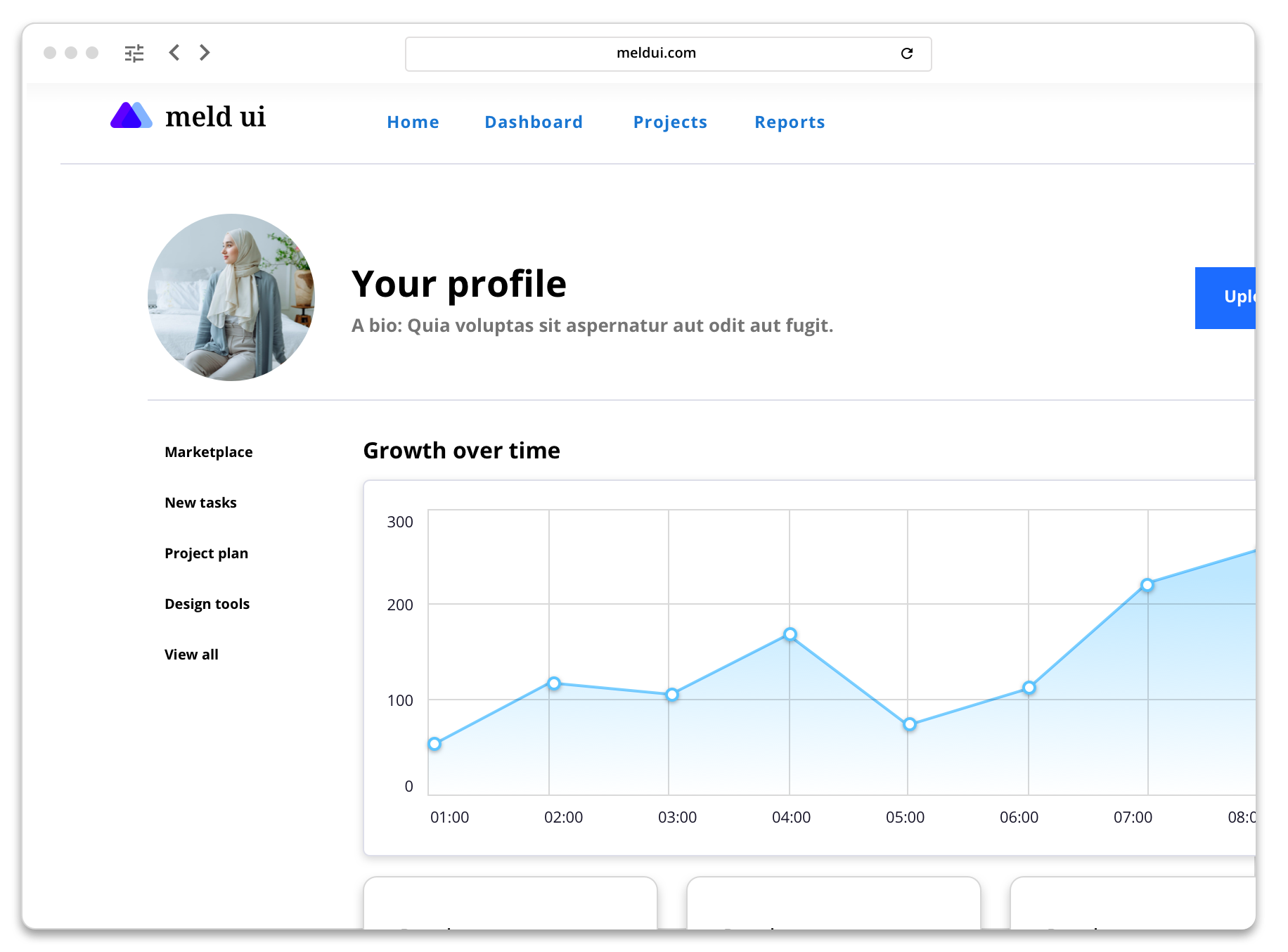
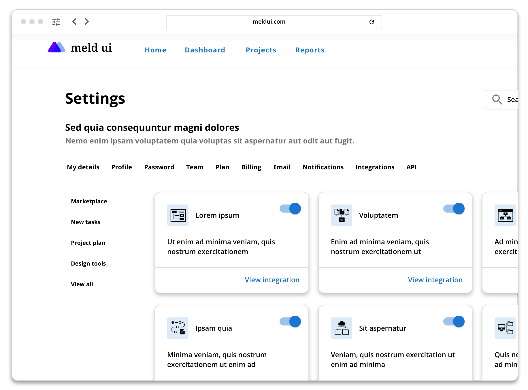
Meld is a design system created to solve the needs of users who appeared to struggle with newer UI libraries such as Material Design. It drew heavy initial inspiration from Google’s Material Design but adds a heavier focus on accessible color contrast levels and larger font sizes to support low vision users.
To create the design system, I did:
Analysis of current Material Design elements’ usability concerns
Review of other design systems’ strengths and weaknesses
Creation of basic components such as buttons and text fields, as well as more complex elements like data visualizations
Component testing via creation of sample layouts
Typography
Meld uses Open Sans by default, in weights Bold, SemiBold, and Regular. Light may be used for certain large headlines but is not included in the official pallet because it is not accessible for low-vision users in smaller sizes. For languages not supported by Open Sans, Noto Sans is used.
Colors
In addition to accessible primary colors, secondary colors for data visualizations and supporting graphics were also selected. Colors are based on Masataka Okabe and Kei Ito’s Color Universal Design pallet, and have been tested for colorblind visibility.
Spacing
Meld uses a standard 5px spacing grid.


